Notes
font-weight: lighter; ,font-weight: normal; ,font-weight: bold; display: inline; stacks items beside eachother horizontally.display: block; stacks items on top of eachother vertically, each item takes up full width.- Browser assumes body tag wants margin around.
- Margin will collapse into eachother, largest margin will take presidence.
- To center an element
display: block; width: unit; margin-left: auto; margin-right: auto; . - Use
line-height instead ofheight for input fields because more browsers will honor it. - Flexbox is god.
justify-content: start; ,justify-content: center; ,justify-content: end; ,justify-content: space-around; ,justify-content: space-evenly andjustify-content: space-between; controls right to left (main axis).gap: top bottom left px; - Only affects direct children (if you don't want something effected, change it to be within divs).
flex-direction: column, row; has default value row, changing to column will switch the align items and display-content axis.align-items: start, center, end; controls top to bottom (cross axis), has default value stretch.flex-wrap: wrap, nowrap, wrap-reverse; keeps the items in the defined max-width and pushes items to a new line.flex-grow: 1; used on the child item, will increase the width of the item to the full width.- Setting
margin: auto; anywhere will push the item to the oposite side. align-self: flex-end, flex-start, stretch(default), center; allows you to set the vertical alignment of an individual element inside a flexbox.display: flex; as parent element andmargin: auto; as child element centers element.flex-basis: numberpx; used on the child element, will set the initial main size of a flex item.flex: flexGrowValue flexBasisValue flexShrinkValue(optional); flex-shrink: 1; will help items shrink to fit any available space.- Order Property
- Reordering flex items.
- Default order value is 0. If you set it as less then 0, it will go before anything that hasn't had their value set.
order: 1; - Typically you will only use -1, to display an item first, or 1, to display an item last.
- Divs are
display: block; by default. - Don't use pure black or pure white because it will block/show all light emitted from the screen, making it difficult for your viewers.
background-size: cover; will make the background the width of the container.- Buttons and inputs don't inherit font-family. Use
font-family: inherit; - The span tag is
display: inline; - Use id for unique elements that will only be used once.
- Use classes for elements that will be reused.
- .webp is similar to .gif, but is more compressed.
text-shadow: horizontal-line vertical-line blur color; - You can't force the width or height of an inline element.
div s aredisplay: block; - WAI-ARIA is used to make background images more accessible. Add a role attribute to the section your background-image is on and set it to img.
(
role="img" ") then add the aria-label attribute (aria-label="description" ). This is used as a supliment to semantic HTML, not a replacement. - The
em tag adds symantic meaning, screen readers can emphasize. - Add audio by using
audio tag, and controls. You can add an anchor tag between the audio tags as a backup incase the audio fails. Put asource tag between the audio tags and add the src attribute in order to have multiple sources. You can also add a type attribute audio/mp3 or audio/wav. Otherwise just add the src attribute to the audio tag. video is the same as audio. Video width and height should always be set to pixels. This saves the required space on the page, without a fixed height and width the layout can change when the file loads.- Video and audio specific attributes: controls, muted, loop, autoplay.
- HTML tables are for structuring tabular data (informatin presented in a 2d table comprised of rows and columns of cells).
- Don't use tables to create layouts, or literally for anything else basides tabular data.
thead tbody andtfoot improves accessibility.- The
colspan attribute determines how many columns table data takes up. - The
rowspan attribute determines how many rows table data takes up. - The
caption tag is the title of a table. It should be the first child of the table. - The scope attribute is used to tell screen readers exactly what cells the header is a header for. add next to th
- 320px is pretty good for almost every mobile device width wise.
- Abbreviations aren't always helpful.
id s shouldn't be used for styling.user-selec: none; stops users from highlighting the text. Only use in very specific senarios.- Box Sizing
box-sizing: border-box; - Border-box gets the item to fill width with margin, padding, and border included.
- The
dialog tagdialog {} dialog::backdrop{}
text-decoration: underline, overline - The
:focus state is for people who navigate with a keyboard, place it with the:hover state, it should be above:active state. - To determine what state to use LOVEHATE Link visited hover active.
- Love is LV.
- Hate is HA.
- L is for
:link - V is for
:visited - H is for
:hover - A is for
:active
text-decoration-style: solid, double, dotted, dashed, wavy; - CSS Points
- Element = 1 point
- Class = 10 points
- Id = 100 points
- Add the total together for compound selectors total points.
- Compound Selectors
- Using multiple selectors to select one element.
- Controversial because devs hate doing math.
!important - Often misused (by me).
- Disrupts the natural cascading reading of css.
- Good for custom css from user for accessibility.
- Don't be too specific with class names, like colors in name, you might change colors.
- Block Elements
- Stack on top of eachother.
<div> ,<p> ,<h1> , etc. are all examples of block elements.- You can set the height and margin top and bottom.
- Inline Elements
- They sit side by side.
<span> and<a> are examples of inline elements.- You can't set the height and margin top and bottom.
- Inline-block Elements
- Sit side by side.
<button> and<input> are examples of inline-block elements.- You can set height and margin top and bottom.
- Multiple Classes on the same element.
- List in html with space between them.
- Overflow
- Default is visible (ugly).
overflow: hidden; hides the excess content, useful for maintaineing the layout but can lead to inaccessbile content.overflow: scroll; adds a scrollbar to the container even if there is no overflow.overflow: auto; adds a scrollbar only when there is an overflow.- overflow-x and overflow-y control the overflow behavior separately for horizontal and vertical content, except x cannot be hidden while y is visible.
- Floats
clear: left; means nothing will float to the left of the item.- Float is good used for drop caps, floating quotes, floating information boxes.
- float but keep item in container, use
display: flow-root; .
- Can use CSS to hide an element (bit complex) to make the element used for screen readers only.
- inverse is a common class name for dark backgrounds with light text next to light backgrounds with dark text.
position: absolute; - Use on the child element.
- Put
position: relative; on parent the element so the child element stays within the container. - Use
top: ; ,left: ; ,bottom: ; , andright: ; to move child element. - Use to position an element relative to a containing element. The element scrolls with the content.
position: fixed; - Needs a
top: ; ,left: ; ,bottom: ; , andright: ; . Addmargin: auto; to center it completely. - Use this to lock an element in a position relative to the window. It maintains that position even when scrolling.
- This is not part of main or header content.
- Needs a
- If you have white space under an image change it to
display: block; . - z-axis (content stacking) is controlled by
z-index .- It controlls the z axis order of positioned elements (
position: relative, absolute, fixed, sticky; ) and their descendants. - The default is
z-index: 0; . - Follows traditional numerics.
- You can use negative z-indexs.
- If the container is
position: relative; and you setz-index: 0; , the content within the container will never go behind the container.
- It controlls the z axis order of positioned elements (
- flex-direction: row-reverse;
- Changing the order of elements.
- To change the color of a radio button checkbox thing, use
accent-color: hexCode; . - To change the color of a scrollbar, use
scrollbar-color: hexcodeForUpArrowsAndinnerBar hexcodeforBackgroundColorOfBar; - To remove a users ability to resize a textarea, add
resize: none; to the textarea selector. - When using a percentage for width, the percentage is based on the width of its parent element.
- The em unit
- The em unit can be used to dynamically set font sizes that are relative to their parents font size.
- 1 em is equial to the parent's font size value. If no parent has a declaired font size, it will default to the browsers default font size, which is usually 16px.
- To convert a px value to em, divide the desired pixel value by the parent elements font size in piels. You can also use the W3 Schools converter.
- Margin and padding values in em are realative to the elements current font size value.
- Works on gap too (same logic as padding/margin)
- An em value can compound from one level to the other.
- Best used for margin, padding, and gap, not font size.
- The rem unit
- Best used for font sizes.
- Stands for root em.
- A rem unit is always relative to the root html element.
- By default, a rem value will be a multiple of 16px.
- The calculation is the same as em, divide the desired pixel value by the root html value.
- Solves combounding issues.
- Text Line Height
- When setting line hight it is recommended to use a unit-less number.
- Line Height is relative to the closes font size.
- Set your line-height at approximately 1.5 times the font size (150%).
- When setting the width you should use percentage for flexible things like containers and images.
- For max-width use px as it is easier to manage and ensures consistency.
- Media Queries
- Modifies your layout depending on the browser width.
- media max width
@media (max-width: numberpx){ //only runs if width is numberpx or smaller. } - media min width
@media (min-width: numberpx){ //only runs if width is numberpx or larger. } - media max and midn width
@media (min-width: minNumberpx) and (max-width: maxNumberpx){ //displays between minNumberpx and maxNumberpx } - Learn more about media queries from MDN Web Docs.
- To stay organized, keep all media queries at the bottom of your page. Some devs will put media queries directly next to what it is for, that's fine too. I think it's ugly though.
- Mobile First
- Think mobile first.
- Optimizing the experience for mobile users and putting their needs first.
- Mobile First CSS
- Write your base CSS with mobile devices in mind first.
- Use media queries to adjust the layout and design for wider screens.
- Why Mobile First?
- There are more mobile users than desktop users.
- Going desktop to mobile, you often override a lot of base CSS and end up repeating many CSS properties just to accomidate smaller screens.
- Ends with DRYer code.
- Mobile first means content first. Display the content users need on mobile devides and nothing extra.
- Avoid access white space.
- It's common to display important nav links on mobile as block level elements so they take up the full width of their container. This way, since the primary interactive method is through touch, it is a more accessible user experience.
- Common Breakpoints
- Mobile Devices (phones): 480px
- Tablets: 768px
- Smaller Computer Screens/Laptops: 1024px
- Desktops and Larger Screens: 1280px
- You do not have to use these.
- Documentation on how to use devtools to test different device modes in chrome.
- Documentation on how to use devtools to test for responsive design in Firefox.
text-transform: capitalize, lowercase, uppercase; - Viewport Units
- Always relative to the size of the users viewport.
- vh - viewport height
- vw - viewport width
- 1vh is equal to 1% of the viewport height.
- Display content occross the whole height of the users screen.
min-height: 100vh - 1vw is equal to 1% of the viewport width.
- To have the font-size adjust with the size of a users screen use vw
font-size: 5vw;
- Setting a background image
background: colorHex url('location'); - When setting a background image, you should always include a color as a fallback.
- To allow only certain file types use accept.
input type="file" accept="image/png, image/jpg"> - The ideal line length is 50 to 75 characters.
- Universal (*) Selector
- Selects all elements.
- Should add before and after psudo elements.
*, *::before, *::after {}
- CSS Grid
- It's 2 dimensional (Flexbox is one dimensional), which offers precise positioning control.
- Less HTML to write, less "wrapper" divs.
- Source order independence, great for responsiveness, but can have accessibility issues.
- Grid Columns and Gap
display: grid; - Margins no longer collapse.
- Elements in a grid container become grid items.
- Grid items fall into place on the grid.
grid-template-columns: none(default value); grid-template-columns: 5em 10em; will display two columns, the left smaller than the right.column-gap: units; creates a gap between the column items.row-gap: units; creates a gap between the row items.gap: rows columns; creates a gap between the row and column items. This can be used as shorthand for column-gap and row-gap. You can use one units if you want them to be the same units.- You should use the fr unit for gap in a grid.
- If you set one to auto ingrid-template-columns, it will only take up the space it needs.
- The default for grid is a single column.
- the fr unit
- "fr" is short for fraction.
- The fr unit represents a fraction of available space in the grid.
grid-template-columns: 1fr 1fr 1fr 1fr; will create four columns with equal widths. It will take gaps into consideration.
- Grid rows and implicit grid
grid-template-rows: em; - If you give a specific height, the content may overflow.
- You can align and justify this content using justify-items, align-items, justify-content, align-content, justify-self, and align-self.
- You can use grid-template as shorthand for both grid-template-rows and grid-template-columns.
grid-template: rows / columns; - Placing items on the Grid
- grid-row/grid-column and the span keyword.
grid-column: span 2 will have the column take up two columns. When using span you cannot reorder. - grid-row/grid-column and line numbers. they start with 1, you will always have one more line number than cells.
grid-column/row-start: 1; grid-column/row-end: 13; - Can be shortened by using
grid-column/row: 1 / 13 - If you want the grid-column to end at the end you can use -1.
grid-column: 1 / -1; - You can combine grid span with start/end.
- grid-row/grid-column and the span keyword.
- Repeat Function
- repeat(how manu times, what to repeat)
grid-template-columns: repeat(8, 1fr); grid-tempalte-columns: repeat(7, 1fr) auto; grid-tempalte-columns: repeat(4, 30px) repeat(4, 1fr); grid-tempalte-columns: repeat(3, 30px) 20px 40px repeat(3, 1fr);
- grid template areas
- grid-tempalte-areas, grid-areas
- To write a grid with four columns across and four rows down.
.grid-container { grid-template-areas: "nameOne nameOne nameOne nameOne" "nameTwo nameThree nameThree nameFour" "nameTwo nameThree name Three nameFour" "nameFive nameFive nameFive ." //the dot will be an empty cell } .name-one { grid-area: nameOne; //will display completely across first row } .name-two { grid-area: nameTwo; //will display as left hand sidebar } .name-three { grid-area: nameThree; //will display in the two center columns and rows } .name-four { grid-area: nameFour; //will display as right hand sidebar } .name-five { grid-area: nameFive; //will display accross the last row minus the last column } grid-area: chosenName; - You cannot go around corners.
- You can replace a name with a dot to have an empty cell. You can use multiple dots to help make the layout more legible.
- When naming the grid area you can name them one letter, if you do multiple letters it is best to keep them all the same length.
- Grid Auto Rows
- Specify a given height value to all implicitly generated row tracks.
grid-auto-rows: 75px; makes all implicitly generated rows 75px in height.
- Auto Fit
- Fit as many columns to the grid as possible.
grid-template-columns: repeat(autofit, 1fr); will have each item take a row.grid-template-columns: repeat(auto-fit, 100px); will fit as many columns in each row as it can while keeping each cell 100px wide.
- auto-auto-flow: dense;
- Pack the grid items as densely as possible.
grid-auto-flow: dense;
- minmax(min, max)
- Defines a size range greater than or equal to min and less than or equal to max.
- Will use the largest size possible, without breaking the rules.
- The min value cannot be 1fr.
grid-template-columns: repeat(auto-fit, minmax( 100px, 1fr));
- You can import font in CSS files by using
@import url('fontURL'); - To center something vertically using grid, use
place-content: center and in the body useheight: 100vh; - When using the before phseudo element on an element change the parent to position relative and the before to position absolute.
- A color stop based gradient
background: linear-gradient(0deg, rgba(34,34,34,1) 32%, rgba(28,28,28,1) 32%, rgba(28,28,28,1) 100%); creates two grey blocks - To underline text
parentEl { position: relative; } parentEl:before { position: absolute; content: ''; height: 0.2em; width: 80%; bottom: 0.5em; z-index; -1; background: background-color; } - To make a watermark behind text
parentClass:before { content: 'watermark content'; font-size: 15em; position: absolute; color: color with minimal contrast to background; z-index; -1; white-space: nowrap; left: 30%; top: 15%; }
Resources
- User Way
- Checks the contrast of two colors to see if it's accessible.
- Coolors
- Generates random colors and pallets for designers.
- Has a tool that can choose colors from an image.
- Unsplash
- The internets source of freely-usable images.
- Google Fonts
- A bunch of fonts supported by google.
- Place link text in head of HTML.
- Add font family to CSS.
- 1001 Fonts
- A bunch of free fonts.
- Find desired font, download the font, use the .ttf file, and add CSS (
@font-face {src: url(filename.ttf); font-family: fontname;} ) - Comes with a cost, the website has to load the resources which slows down site speed.
- Limit yourself to two or three fonts per page to help loading size/time.
- Use fonts with multiple weights or styles to get more versitality without needing extra fonts
- Giphy
- A bunch of gifs for use.
- Figma
- A site for creating layouts for developers.
- UI Gradients
- A site that loads a random gradient.
Definitions
- CSS Syntax
- The way we write css code
Selector {Property: Value}; - px
- Pixel
- The smallest unit of space that our screens can rendor.
- Auto
- Automatically adjusted.
- Used for margin, if size is not declaired it will not work.
- Takes up all available space.
- The Box Model
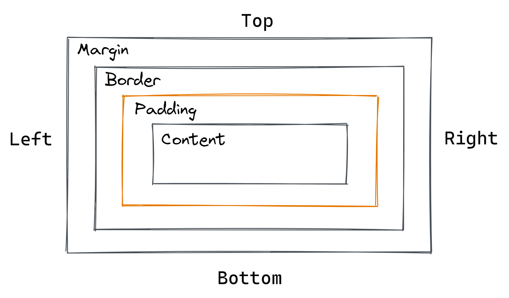
- Margin, border, padding, content.
- Relative Path Syntax
- An address that points to the current directory or project folder.
./ starts from the same directory the current file is in, it is more explicit and gives a visual reminder your referencing a file within the project../ starts from the parent directory of (the directory above) the current file// starts from the projects root directory.- Utility Class
- A class for a single css property.
- Example:
.italic{font-style: italic;} - CSS Inheritance
- Controls what happens when no value is specified for a property on an element.
- Learn to write DRYer (don't repeat yourself) code, fewer bugs, be more efficient.
- Css properties that are inherited.
- Web Safe Font
- A font that's preinstalled in the browser.
- Web safe Fonts List:
- Arial (sans-serif)
- Verdana (sans-serif)
- Tahoma (sans-serif)
- Trebuchet MS (sans-serif)
- Times New Roman (serif)
- Georgia (serif)
- Garamond (serif)
- Courier New (monospace)
- Brush Script MT (cursive)
- Font Stack
- A list of fonts and font keywords used to let a browser know our preferred and fallback fonts
font-family: Verdana, Geneva, Tahoma, sans-serif; - Sans Serif is a font category, sans means without or not.
- Replaced Elements
- An elements whos representation is outside the scope of CSS.
- Element is not rendered directly by the browser but an external process
- The content of the replaced element is external to the HTML document
- pseudo-class
- a selector that selects elements that are in a specific state
- :hover, :link, :visited, :active, :not
- specificity
- The more specific a css selector is, the higher it will be prioritized
- id selectors are more specific than classes
- Em tag - emphasis
- used for words or phrases that would be stressed when spoken
- important for assistive technologies
- italic
- inline element
- Strong tag
- bold
- used for importance seriousness or urgency
- important for assistive technologies
- inline element
- Replaced Element
- An element whos contents are not affected by CSS
- iframe, audio, embed, video, img
- Absolute Unites
- Pixels
- will always appear the same size no matter where you view them.
- Relative Units
- Percentages, em
- Relative to another value.
- Dynamic flexibility.
- Resize and scale.
- Breakpoints
- The point media queries get introduced (like the min and max width in px)
- Change layout, update text size, page adjustments.
Questions
- Why do people use even numbers for px in css? -- because they are easier to divide if you need to output different sized icons (???)
- Is it better to do /folder/file or folder/file?
- /folder/file = file is located in the folder at the root of the current web page
- folder/file = image is located in the folder in the current folder
- ../file = file is located in the folder one level up from the curent folder
- Should WAI-ARIA be used only for context relevent background images or all?
- Is it bad practice to write list-style: none instead of listy-style-type: none to remove bullet points?